
Thankfully, inflation is slowing down. Prices rose only 0.1 percent in November, yielding the lowest annualized inflation rate (7.1 percent) in a year. Core inflation, which excludes volatile food and energy prices, rose 0.2 percent (6.0 percent annual). While it’s too soon to celebrate, there’s hope for continued disinflation.
Let’s take a look back. Where did all this inflation come from? There are two broad possibilities. The first is expansive aggregate demand (loose money). The second is flagging aggregate supply (productivity problems). A big-picture analysis shows that both matter, but demand matters more.
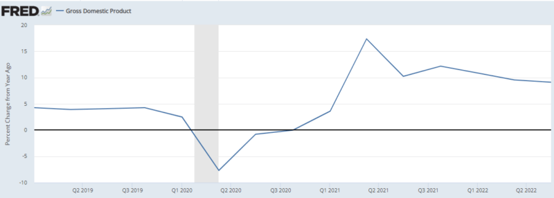
Remember, aggregate demand comes from the dynamic version of the equation of exchange: growth in effective monetary expenditures (gM+gV) must equal growth in nominal GDP (gP+gY). Before COVID, we were on a steady nominal GDP (NGDP) growth path of 5 percent per year. After the COVID shock, nominal spending growth increased to approximately 10 percent per year. Aggregate demand is obviously elevated. But what’s going on under the hood?
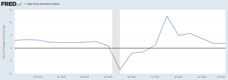
When checking real (inflation-adjusted) GDP, we see a similar pattern to NGDP. Pre-COVID, the economy’s growth path was somewhere between 2.5 and 3 percent. The post-COVID equilibrium ranges from 1.7 and 2.0 percent. At most, that’s 1.3 percent per year lower in real income growth. Let’s assume the dropoff can be explained entirely by productivity problems, such as supply-chain issues. That means supply-side woes are adding 1.3 percent to inflation. That’s not trivial, but neither is it the lion’s share.
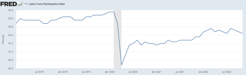
Unemployment is perhaps the strangest indicator. Before COVID, the unemployment rate was very low, at 3.6 percent. After the COVID craziness, it increased to…3.7 percent, which is also very low! Despite lackluster growth, the US economy appears close to full employment. There’s a complicating factor, however: labor force participation permanently declined after COVID, partly due to generous government transfer payments.
Getting back to supply and demand, we can easily have full employment and surging inflation if aggregate demand is too high. It’s harder to see how this can work if the cause is low aggregate supply. You’d expect diminished productivity to cause an uptick to unemployment. That hasn’t been the case so far.
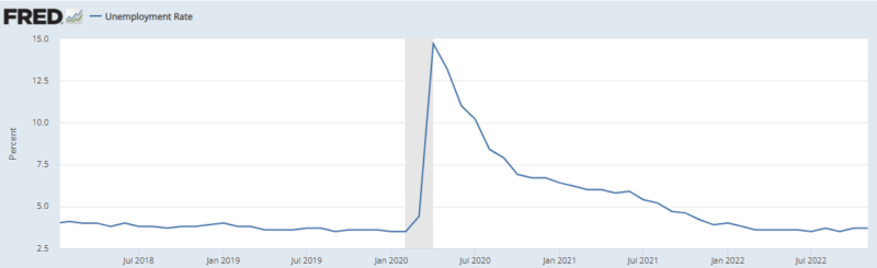
Figure 4: Labor Force Participation

Now let’s consider productivity. The best measure is probably total factor productivity, but this data series hasn’t been updated for the COVID and post-COVID years. Instead, we’ll look at labor productivity, in terms of output per hour. (We’re measuring averages here, not marginal contributions.) Perhaps counterintuitively, productivity spikes during COVID. This actually makes economic sense. Many fewer workers were working. If businesses sent home the least productive workers first, as one might expect, those that remained would tend to have a higher average level of productivity.
Figure 5: Average Labor Productivity
Before COVID, labor productivity grew between 1 and 3 percent per year. Since then, it’s fluctuated much more widely, frequently venturing into negative territory. The average over the past eight quarters is -0.68 percent. The most recent figure, Q32022, is back into positive territory (0.8 percent). This reinforces a partial productivity story.
Supply-side issues are a problem, but in terms of magnitudes, it just doesn’t make sense to call them the chief contributor.
Related Posts

Operation Chokepoint 2.0: The Crypto Crackdown Explained (Video)
In this episode of Liberty Curious, Kate Wand discusses the Obama-era Operation Chokepoint, and today’s “Operation Chokepoint 2.0” with AIER Senior Research Faculty Thomas Hogan. Tom explains how government regulators […]

Earth Day, Waste and Productive Complements
It has been just over half a century since the first Earth Day in 1970. Over that time, April 22 has turned into a day with lots of waste cleanup […]

Focusing Exclusively on “Creating Jobs” Can Do More Harm Than Good
We are constantly bombarded by politicians declaring the importance of “creating jobs” in the economy. We regularly see government initiatives like public works projects, “stimulus” programs, and government subsidies enacted […]